Sargon Rebranding – New vision, Enhanced Concept
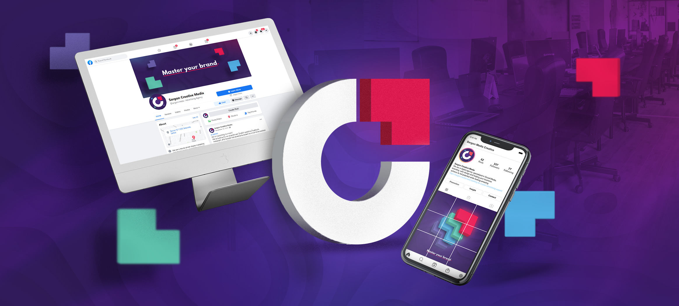
Follow the enhanced branding and concept process of marketing agency Sargon Creative Media, showcased step by step!
read more
GRAPHIC DESIGN
| Client | Services | Year |
|---|---|---|
| Graphic Design, Packaging Design | 2017. |
Modern tastes require modern solutions. That is why, upon a client’s request specialized in food production, we created a package of chips through a modern design that reflects the current market trends in the food industry. For a complete understanding of our creative process, we will visually and descriptively present the concept, as well as the realization itself. Enjoy!
The old packaging required a more modern look, as it did not clearly communicate the true qualities of the product. It simply did not provide adequate visual value. Therefore, we intended to highlight the splendor of intense flavors that are – like the product itself – irresistible.
The improved color scheme helped to make the entire packaging more clearly associated with the taste itself, while the illustrations make the design unique and fresh. The intense red color attracts the most attention and makes our visual display of taste clear at first sight. Therefore, the accentuated taste of the product now attracts the desire to nibble.
The taste of the snack is also more complementary to the current design, and the font on the packaging is legible, which improves communication with consumers.

When it comes to branding, the most important thing is to clearly communicate the message of the product, which was our main intention. Colors psychologically strongly influence people’s behavior and decision-making – that’s why we decided on intense shades in the design that make the packaging striking and unique.
Also, the background color of the promotional poster further emphasizes the irresistible tastes of this snack, which completes the visual communication.

Modern and authentic packaging instantly grabs attention and clearly communicates its qualities. The product is now more memorable and unequivocally characterizes the taste of the product, allowing the overall attractive solution to occupy attention.
The dynamic design, which shows the crunchiness of the snack and the intense taste of the paprika, allowed a clear association with the taste, at the same time depicting the intense pleasure that the product provides.
If you liked the presentation of our work, you can share it on your social networks. If you have additional questions, feel free to contact us and we will be happy to answer them.
Need help developing your brand? Our team can help you with that! Send us an inquiry by filling out the contact form.
Follow the enhanced branding and concept process of marketing agency Sargon Creative Media, showcased step by step!
read more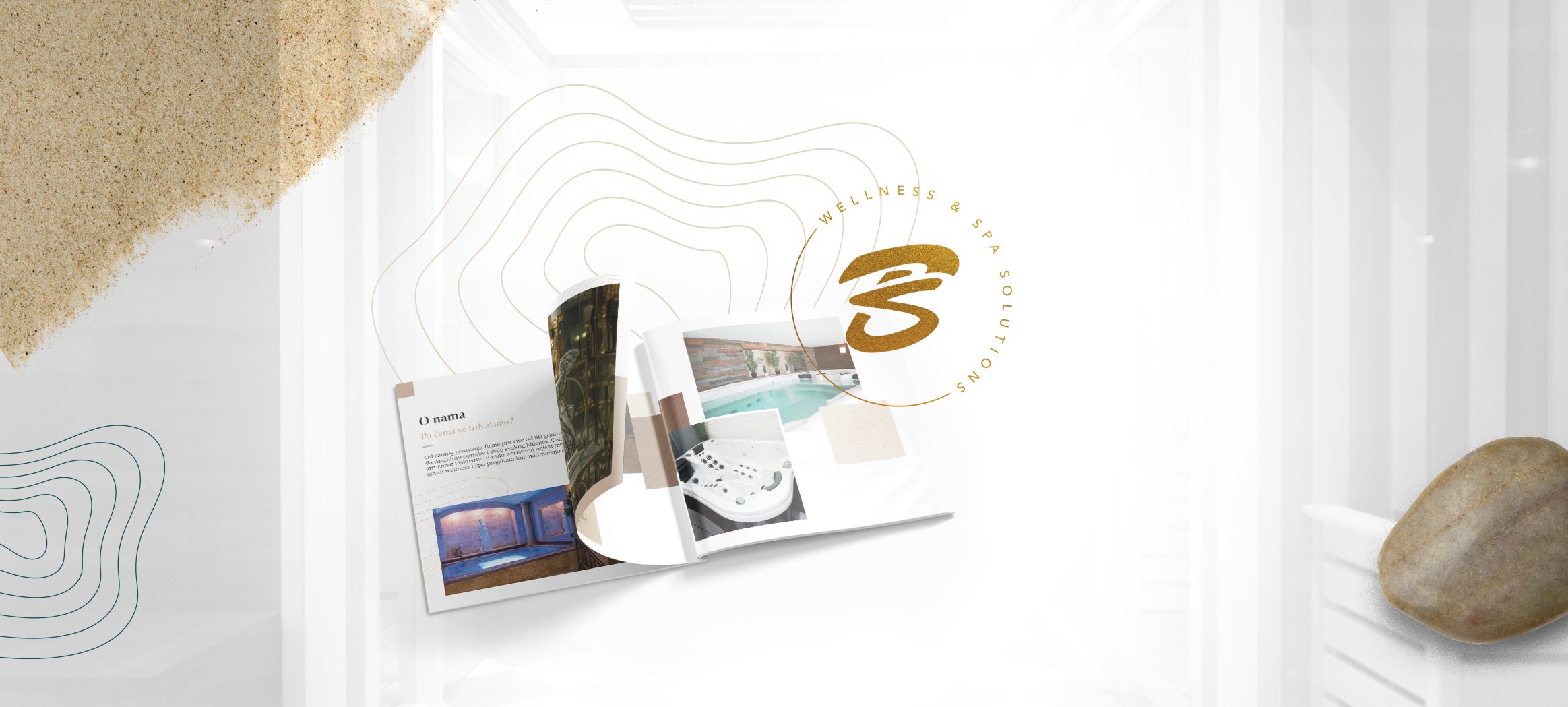
Take a look at our striking catalog design that we created for Bibis, a leader in the Wellness and Spa industry in the Balkans.
read more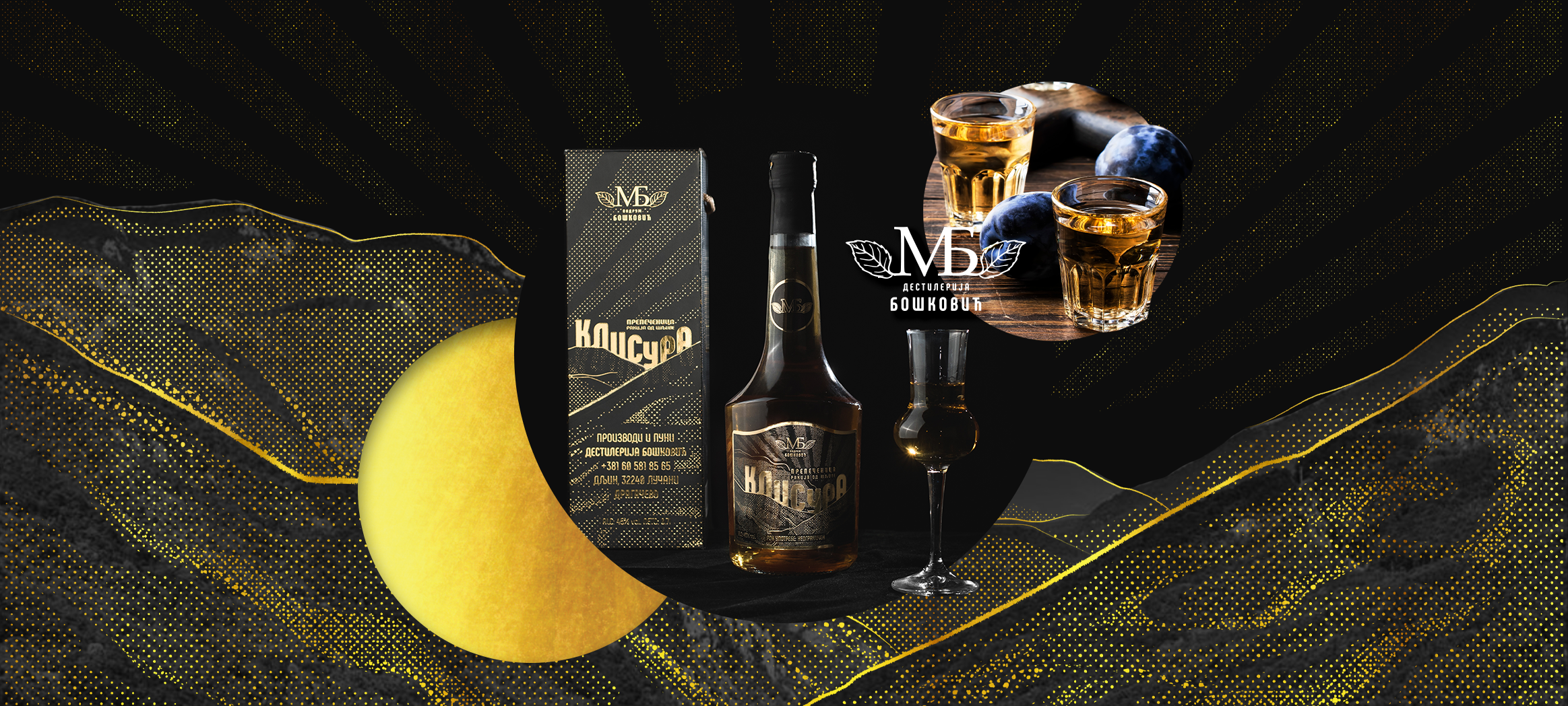
Throughout history, Serbian national brandy has been known as firewater and even the water of life. What does the graphic design for Rakija Klisura look like?
read moreSchedule a meeting or conference call from anywhere in the world.
We’ll get back to you in the next 24 hours.
Want to give us more details right from the start? Fill out our meeting
/
conference request below.
If you have an urgent need to contact us right now - you can always reach us by phone or Skype on
our contact
page.
Subscribe to our newsletter.
Promise to only send you the interesting stuff!
