Bibis – Designing a Great Catalogue
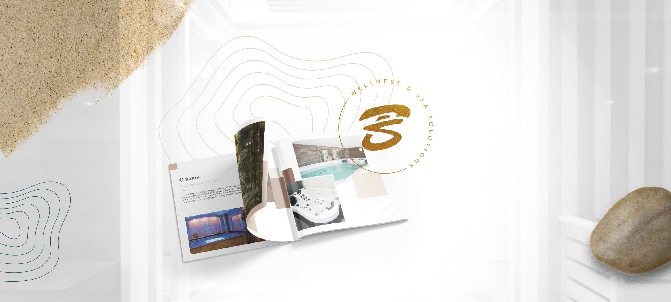
Take a look at our striking catalog design that we created for Bibis, a leader in the Wellness and Spa industry in the Balkans.
read more
REBRANDING AND ENHANCED CONCEPT
| Client | Services | Year |
|---|---|---|
| Sargon Creative Media | Rebranding, Graphic Design, Web Design, Web Development, Media Production | 2021. |
In a year full of everyday challenges, Sargon managed to successfully overcome all obstacles, conquer new markets and turn its potential weaknesses into strengths. From an uncertain atmosphere that overcame most companies from our industry and beyond, with battle scars to show, Sargon rose stronger than ever. One was for certain: A time for change was upon us.
Learn more about the upgraded brand and concept of the Sargon Creative Media marketing agency.
Since we didn’t want to do a complete rebranding, the starting point was the old Sargon Creative Media logo. The difference that catches the eye right away is the apparent change made to the letter “O” in the inscription – from a presentation of analytics – to a stylized “O” with a unique element that presents an arrow pointing in a certain direction.
Further analysis shows the complementarity of the letters G and O, which are derived from the circle, and together form the word “GO” which means movement, encourages progress, and together with the arrow symbolizes growth.

What sticks out in our new branding concept are the arrows. Why arrows? The idea came to us from history, and to be exact, from the person whose deeds and himself inspired the name Sargon Creative Media. Namely, Sargon of Akkad, that is, Sargon the Great was the ruler of the Sumerian city-states in the old era, and founded the first known empire called the Akkadian Empire. As part of this ruler and his soldiers’ great legacy, a record remained from which we recognized and developed the shape of the arrows. Hence the direct inspiration for this element of our logo. The meaning of the record itself, which refers to Sargon of Akkad, is “The king has arrived (arrived on the throne)”.
In our entire branding, we can see the existence of four types of arrows within the emblem, which symbolize four different sectors of our agency, and which are positioned in four directions. In the last year and a half, Sargon Creative Media has recorded significant but stable business growth, with a clear segmentation of four sectors as each sector continues its personal growth.

Elements that we created with the purpose of upgrading our agency’s brand were designed in a way to show the synergy that exists within our team. Sargon Creative Media is one of the rare agencies on the market that really provides a full package deal – which means that we are able to provide all services needed for promoting your products and services in the vast digital ecosystem.
The main logo is in color, but we also made the version of the logo in negative.

Whilst defining the colors for the new Sargon brand concept, we didn’t deviate much from the already defined values. We’ve retained the distinctive colors for each sector that run through all branded digital and printed material.
We chose bold colors and striking shades precisely because they perfectly depict the creativity, motivation, and ideas that drive the Sargon team. These shades are ideal for use in both digital and printed branded material design.

When considering the fonts for this internal project, we were guided by the fact that the fonts should be modern, fully adapted for use in printed and digital materials, and preferably non-serif.
We found all of this in two, new fonts for us, which we then included when setting up our enhanced branding. After a detailed analysis involving both the graphic design team and the web design team, we decided on the following two fonts:
The selected typography perfectly tied the entire process together, and now we had the perfect foundation for creating further branding material.

As the already mentioned arrows are one of the vocal points of our enhanced branding, we decided to give them another purpose – that’s how the idea for the Sargon pattern came about. We’ve formulated two versions, one of which contains specific Sargon circles with incorporated arrows, and the other is based directly on the arrows in the colors of our sectors, which are repeated throughout the design.
These patterns will also get their two practical applications when it comes to our brand, but we don’t want to reveal everything right away!

We love digital media design, but if we get a chance to showcase our creativity in designing printed materials, we use it to the fullest!
Sargon envelopes, memorandums, and other branded materials got a new, modern makeover, in line with the new elements, colors, and fonts that we established earlier. Whilst creating the concept for this material, our priority was to create a simple (clean) and effective design that will make our enhanced branding whole.

Even though traditional, business cards are still an effective way to leave an impression. During business meetings, conferences, and courses, they provide a perfect way to connect, exchange contact information and encourage the interlocutor to remember you and your brand.
Despite starting the rebranding process in a time when networking wasn’t possible, and most of the meetings were held via Zoom calls, we still opted for creating the business cards as well.
We’ve established four types of business cards in relation to which sector each team member belongs to, so we have business cards that differ in the color of the arrows, as well as the directions of the arrows – an element that we’ve already defined previously.

As our entire digital agency and its four current sectors developed from providing digital marketing services, its only right that our digital identity remains of the highest importance.
In order to improve our brands’ online impression, especially in the period when most of the communication takes place on the web, we have conceived digital branded materials that are in line with the elements of our enhanced rebranding design.
The most attention is certainly drawn to the email signature, which is characterized by the same concept for all four sectors but adapted in terms of colors and direction of the arrows. This way, we achieved a harmonized, modern look without uniformity.
For the purpose of creating branded digital material, we organized a photoshoot of our team members in the photo studio, and the photos were further used for each team member’s individual profile photo on social media networks and their personalized email signature.

The next piece as part of our online branding puzzle was social media networks. As an agency that provides our clients with services such as managing and growing their social media accounts, we are aware that visual elements speak louder than a thousand words. With that in mind, we’ve improved all the visuals on our social media profiles so that they’re fully in line with our team’s vision.
Visuals for our Facebook, Instagram, and LinkedIn profiles as well as cover photos from Facebook and LinkedIn got an upgraded version that better communicated our agency’s values. With the visuals in place, our brand’s digital identity was set.

How many ideas fit in a 350m2 space?
Our constantly-growing team needed a large enough space for work, after-work hangouts, celebrations of small and great achievements, meetings, and brainstorming. When we first found our new work space, it didn’t resemble anything you see today, but we knew it was “the one”.
When furnishing our space, we were guided by modern interior design trends, all in accordance with our teams’ needs. What we knew was that we didn’t want a typical, “boring” office, but a modern space where ideas flow freely, but also where projects can be implemented efficiently.
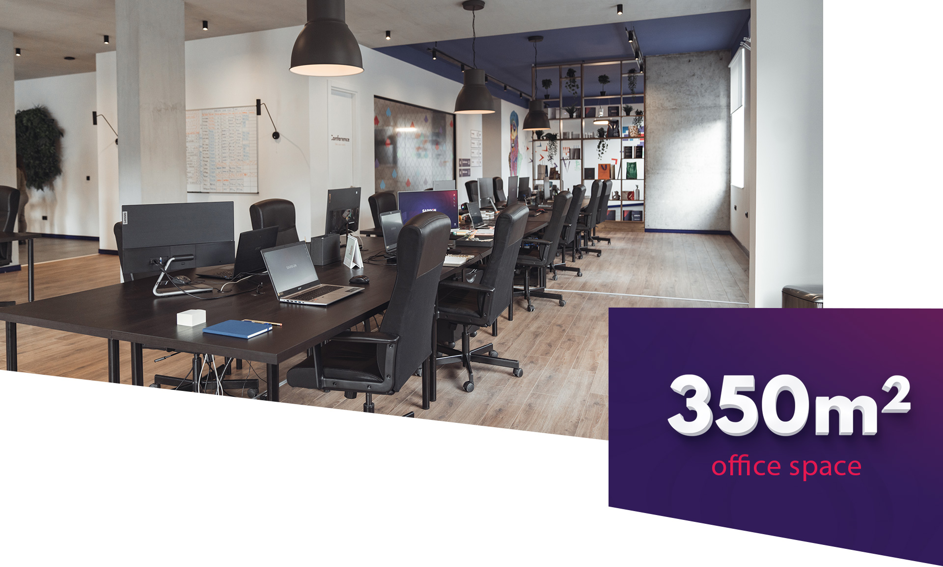
Our business space contains open space, a relaxation area, a kitchen, a meeting room, a pantry, a photography studio and a lobby. For a space like this branded room signs were designed as well as inscriptions on each of the rooms.

Branded elements on the wall in front of our photo studio that represent our four sectors, never fail to catch the eye of each visitor that comes through our front doors. These elements symbolize our entire teams’ ideas, no matter which sector they belong to, as they flow freely through the space striving to find the perfect synergy.

Especially attractive, separated within our workspace is the meeting room, whose glass walls showcase the first direct use of our new branded pattern. The main goal was to create a space that will be functional for business purposes but will also convey our creativity and brand values across its entirety.
Given that the last two years of conducting business are completely different from anything we could’ve ever imagined, we knew we had to adapt to the current conditions – but in a unique Sargon style. With that in mind, we created protective masks for all members of our team using brand colors and defined patterns. Masks represent another practical application of the pattern we have defined.
This way, we enabled the Sargon team to stay safe and healthy, but also to stand out with creativity.

Do you like our approach to branding? Share this example with others on social media and let’s work together! Contact us via the contact form if you have any further questions, or request a meeting by filling the form below!
Take a look at our striking catalog design that we created for Bibis, a leader in the Wellness and Spa industry in the Balkans.
read more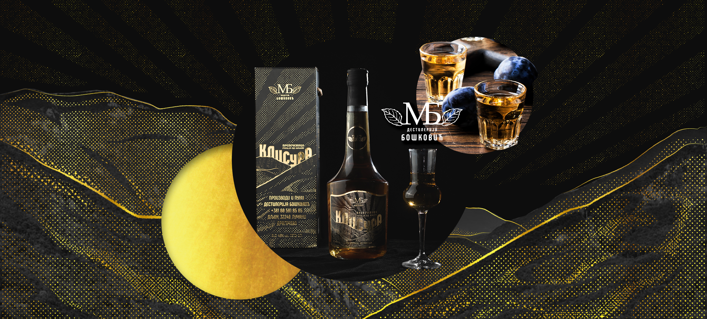
Throughout history, Serbian national brandy has been known as firewater and even the water of life. What does the graphic design for Rakija Klisura look like?
read more
When we give shape to an initial idea and successfully transfer it to real objects, then we know that we have done a great job of graphic design.
read moreSchedule a meeting or conference call from anywhere in the world.
We’ll get back to you in the next 24 hours.
Want to give us more details right from the start? Fill out our meeting
/
conference request below.
If you have an urgent need to contact us right now - you can always reach us by phone or Skype on
our contact
page.
Subscribe to our newsletter.
Promise to only send you the interesting stuff!
